Showing posts with label E-Commerce. Show all posts

Thursday, 5 May 2016

Using JavaScript To Super Power Your Client's Shopify Site


JavaScript is in the midst of a renaissance that would make even LL Cool J jealous.


New frameworks, designed for pretty much everything imaginable, are popping up left and right at a breakneck pace. The proliferation of node and JavaScript on the server has encouraged an increased amount of dialog, spawning ideas like isomorpic JavaScript. Even traditional desktop applications like Spotify are being built (in part) using JavaScript.

In the front end, JavaScript has enabled us to do a number of interactive things like geolocate users and create rich animations.  However, I think the largest contribution made by JavaScript is something that’s largely gone unnoticed: speed.

JavaScript has been admirably trying to help improve speed on the Internet for some time now, however, it should probably go without saying that one of the biggest and most impactful changes on performance brought on by JavaScript was the arrival of the XMLHTTPRequest. XMLHTTPRequest is the underlying technology responsible for all of the ajax requests we make, allowing us to retrieve additional page resources without forcing a full page reload.  Oh, and it’s based on work done by everyone's favorite, Microsoft.

What about right now?

Let’s stop looking backwards and start talking about what JavaScript can do for us today. We’re going to look at some ways that we can leverage the Shopify platform in order to begin using JavaScript in more involved way on your clients' Shopify stores. I’ll show you some of the building blocks that you can put in place and then from there, the rest is up to you.

We'll start by defining what we’re trying to accomplish and what our goal really is. As you will shortly find out (or maybe even already know), once you start wandering beyond the safe and comfortable pastures of HTML and CSS, there’s a chance that you may never come back. All sorts of doors will start opening up for you, but for the sake of staying on track, let’s outline exactly what we’re gonna do today:

    Figure out how we’re gonna get all our product and collection data off of our Shopify server

    Set up templates in such a way to give us exactly the data that we want

    Write some JavaScript that enables us to grab all the data we need on initial pageload

    Address and solve any issues that present themselves along the way

Together, all of these improvements are going to create a smoother and snappier experience for users — one that tends to feel like a native app. Users will get to the things they want to see quicker, spend less time waiting for loads, and be more prone to further exploration and discovery. I also feel pretty confident that the effects of these benefits on items like conversion and bounce rate are pretty self-evident, so let’s instead just jump into some code and get this party started...

Act I:

The very first thing we need to figure out is how, and from where, we’re going to get our data from. Some sort of publicly available API that returned store data would be a good place to start, but unfortunately nothing like that exists...yet (more on that in a sec). There’s the public cart API, which also has a random product endpoint, but it’s really only helpful for executing cart actions. Also, the product endpoint only returns JSON for one item at a time, so if your store contained 300 products, that’s a cool 300 requests to the API every time a new user visits your site. Not exactly the direction we want to head in.

I’ve seen it mentioned in a few places that sending a $.getJSON request to a number of different places (e.g. “products/blue-hat”, “collections/all”), actually returns JSON for whatever thing was requested. This is sorta what we want, but still not exactly. Let’s forge ahead.

Once you start wandering beyond the safe and comfortable pastures of HTML and CSS, there’s a chance that you may never come back.
At this point, you might be saying, “Hey buddy, slow your roll. Maybe we can use one of those .json things to get some of the stuff we need!” And you wouldn’t be wrong — we could do that. However, we would still run into the problem of needing to make one request for every product and collection in our store. Also, there’s relatively little documentation explaining how the whole “URL + .json” thing even works. How do we know that sending a request to the exact same location tomorrow will return the same kind of data we got today? Maybe tomorrow we won’t get anything back.

Since we don’t know who, or what, decides what data we get back from those locations, I’m gonna suggest that we forget about them and move on. But before we do that, take a quick look at the URL we were sending the $.getJSON requests to...


O-m-quadruple-g, it was relative! the response was coming from INSIDE our own server!!

When you think about it, it makes perfect sense. Shopify servers are already set up to be more like APIs and less like static file servers. When people navigate to “http://store.com/collections/cute-motorcycle-jackets,” they’re not really seeing the file at that location. Instead, the Shopify server takes a look at the URL for the requested resource, sees that it needs to plug the “cute-motorcycle-jackets” data into the “collections” template, runs off really quickly to go build that template, and finally comes back to deliver a fully formed .html file.

Now consider this, what if we took one of our theme’s templates, say collections.liquid for instance, and ripped out all of the markup so there was only liquid tags. Then, imagine you navigated to “http://store.com/collections/rad-velcro-shoes,” which now uses the new markup-less collections template. Assuming we got rid of the liquid tags and filters that produced DOM nodes, what you should see is the markup from your theme.liquid template wrapped around a bunch of incoherent text from your collections.liquid template. If you altered the URL just a bit to “http://store.com/collections/rad-light-up-shoes,” and then tried loading that page, you would see something very similar to the last page, except with all the meaningless text updated to reflect items from the “rad-light-up-shoes” collection, as opposed to “rad-velcro-shoes.”

That right there (along with few other key moments I’ve conveniently glossed over) is our big win. It should make you realize that, within reason, the Shopify servers have to do exactly what we demand/politely ask them to do. All that needs to be done now is the legwork required to ensure the whole process runs smoothly. Luckily for you guys, I got your back and already did it.

Act II:

What we’re gonna do next is build some templates that only contain liquid tags and are structured like JSON. We’ll then make an ajax request for these templates as soon as we first initially land on our site. We’ll get a response back from the server, which will be the rendered template, containing all the data we initially set it up to hold. At this point, it’ll just be a long text string and not JSON, so we’ll need to run it through JSON.parse(). We’ll grab what we need and combine it with what we already have, and then link up all the products and collections so we can build a collection quickly, but without duplicating data anywhere.

We’re going to use a few features of the platform to help us accomplish all of this, namely, {% layout ‘none’ %}, alternative templates and ‘?view=’, and Taking Control of your Catalog Page.

Create a new collections template and name it something like "pagination-endpoint." It should look something like this:

{% layout none %}
{
  "totalCollections": {{ collections.size }},
  "totalProducts": {{ collections.all.products_count }}
}
view rawgistfile1.js hosted with ❤ by GitHub
If we’re going to request all of our products and collections from our Shopify server, we first need to know the total number of each before we start. This is due to the fact that when retrieving and displaying information on any liquid template, the max number of items returned (usually products) is capped at 50. To account for that, what we’ll do instead is keep incrementally asking for 50 products, (totalProducts/50) number of times.

This is also where we use the {% layout ‘none’ %} tag and Taking Control of your Catalog Page. The layout none tag tells the server, “when you build this particular template, don’t put it inside theme.liquid/layout frame, just give me the guts.” It makes it easier for us because now we don’t have to parse and trim all the stuff we don’t want in our response from the server. Following the instructions in the article above ensures that there’s a collection at ‘/collections/all/’, it has all our products in it (or whatever ones we want), and that we’re the ones in charge of it (the collection). This is where you could set whether or not you wanted out-of-stock items to be included in the data we’ll use to base our store off of.

Next, create a new list-collections template and name it something like "collections-endpoint." It should look something like this:

{% layout none %}
{% paginate collections by 50 %}
{
  "collections": [{% for collection in collections %}
{
  {% if collection.image %}"image": "{{ collection.image }}",{% endif %}
  "body_html": "{{ collection.description | url_escape }}",
  "handle": "{{ collection.handle }}",
  "id": {{ collection.id }},
  "sort_order": "{{ collection.default_sort_by }}",
  "template_suffix": "{{ collection.template_suffix }}",
  "title": "{{ collection.title }}",
  "products_count": {{ collection.products_count }},
  "url": "{{ collection.url }}",
  "products": []
}{% unless forloop.last %},{% endunless %}{% endfor %}
  ]
}
{% endpaginate %}
view rawgistfile1.js hosted with ❤ by GitHub
A few notes…

Because this is still a Liquid template that’s rendered on the server before it’s delivered to us, we can take advantage of conditional and control flow tags

{{ collection.description }} has a url_escape filter attached to it to preserve the HTML included in a product and collection’s description, while still making sure the description was properly formatted string for the JSON. My solution here is to url_encode the description on the server’s end, store the encoded string and transport it, and upon delivery, run it through decodeURI() to restore it.

Because we’re using an alternate template, we can still use the default collections.liquid and list-collections.liquid to serve content to crawlers trying to index the site. Alternate templates + pushState() should answer any question anyone has about SEO.

It might be retroactively prudent to look into the “json” filter

The products property is an empty array that we’ll populate when we’ve received all our collections and products back from the server, eternally linking our products and collections together forever.
Finally, create a new collections template and name it something like "products-endpoint." It should look something like this:

{% layout none %}
{% paginate collection.products by 50 %}
{
  "products": [{% for product in collection.products %}
{
  "available": {{ product.available }},
  "body_html": "{{ product.description | url_escape }}",
  "collections": [{% for collection in product.collections %}"{{ collection.handle }}"{% unless forloop.last %},{% endunless %}{% endfor %}],
  "handle": "{{ product.handle }}",
  "id": {{ product.id }},
  "images": [{% for image in product.images %}
        {
          "id": {{ image.id }},
          "position": {{ image.position }},
          "product_id": {{ image.product_id }},
          "src": "{{ image.src | img_url: 'large' }}"
    }{% unless forloop.last %},{% endunless %}{% endfor %}
  ],
  "options": [{% for option in product.options %}
        {
          "name": "{{ option }}",
          "position": {{ forloop.index }},
          "product_id": {{ product.id }}
    }{% unless forloop.last %},{% endunless %}{% endfor %}
  ],
  "product_type": "{{ product.type }}",
  "price": {{ product.price }},
  "price_max": {{ product.price_max }},
  "price_min": {{ product.price_min }},
  "tags": [{% for tag in product.tags %}"{{ tag }}"{% unless forloop.last %},{% endunless %}{% endfor %}],
  "title": "{{ product.title }}",
  "url": "{{ product.url }}",
  "vendor": "{{ product.vendor }}",
  "variants": [{% for variant in product.variants %}
        {
          {% if variant.image %}"image_id": {{ variant.image.id }},{% endif %}
          "available": {{ variant.available }},        
          "id": {{ variant.id }},
          "inventory_management": "{{ variant.inventory_management }}",
          "inventory_policy": "{{ variant.inventory_policy }}",
          "inventory_quantity": {{ variant.inventory_quantity }},
          "option1": "{{ variant.option1 }}",
          "option2": "{{ variant.option2 }}",
          "option3": "{{ variant.option3 }}",
          "position": {{ forloop.index }},
          "price": "{{ variant.price }}",
          "requires_shipping": {{ variant.requires_shipping }},
          "sku": "{{ variant.sku }}",
          "taxable": {{ variant.taxable }},
          "title": "{{ variant.title }}",
          "weight": {{ variant.weight_in_unit }},
          "weight_unit": "{{ variant.weight_unit }}"
    }{% unless forloop.last %},{% endunless %}{% endfor %}
  ]
}{% unless forloop.last %},{% endunless %}{% endfor %}
  ]
}
{% endpaginate %}
view rawgistfile1.js hosted with ❤ by GitHub
Keep in mind that you can pick and choose what goes into those templates (save for a few key properties). The only requirement is that what you get back from the server, HAS to be parsable JSON. If any of the data causes JSON.parse() to error, you’re gonna have a bad time.

(function(Resources, $, undefined) {
  // Private
  var requestLimit = 50;
  var collections = [];
  var collectionsHandleMap = [];
  var products = [];
  var productsHandleMap = [];

  var getResources = function() {

var $getCollections = function(totalCollections) {
  var collectionDeferreds = [];
  for (var i = 0; i < totalCollections/requestLimit; i++) {
    var pageNumber = 1 + i;
    var $collectionRequest = $.get('/collections?view=collections-endpoint&page='+pageNumber, function(response) {
      response = JSON.parse(response);
          $.merge(collections, response.collections);
    });
        collectionDeferreds.push($collectionRequest);
  }
  return $.when.apply($, collectionDeferreds).done(function() {
        collectionsHandleMap = $.map(collections, function(collection, index) {
          return collection.handle;
    });
  });
};

var $getProducts = function(totalProducts) {
  var productDeferreds = [];
  for (var i = 0; i < totalProducts/requestLimit; i++) {
    var pageNumber = 1 + i;
    var $productRequest = $.get('/collections/all?view=products-endpoint&page='+pageNumber, function(response) {
      response = JSON.parse(response);
          $.merge(products, response.products);
    });
    productDeferreds.push($productRequest);
  }
  return $.when.apply($, productDeferreds).done(function() {
        productsHandleMap = $.map(products, function(product, index) {
          return product.handle;
    });
  });
};

var $getActive = $.get('/collections/all?view=pagination-endpoint', function(response) {
  response = JSON.parse(response);
      $.when($getCollections(response.totalCollections), $getProducts(response.totalProducts)).done(function() {
        $.each(products, function(index, product) {
          $.each(product.collections, function(index, collectionHandle){
            collections[collectionsHandleMap.indexOf(collectionHandle)].products.push(product.handle)          
          });
        });    
        console.log(collections);
        console.log(products);
  })
    });

  };

  Resources.retrieveProduct = function(handle) {
return products[productsHandleMap.indexOf(handle)];
  };

  Resources.buildCollection = function(collectionHandle) {
var builtCollection = [];
var collection = collections[collectionsHandleMap.indexOf(collectionHandle)]
$.each(collection.products, function(index, handle) {
      builtCollection.push(products[productsHandleMap.indexOf(handle)]);
});
    return builtCollection;
  };


  Resources.init = function() {
    getResources();
  };

}(window.Resources = window.Resources || {}, jQuery))
view rawgistfile1.js hosted with ❤ by GitHub
Based on the above JavaScript, when getResources() is run, a series of requests are sent out to retrieve the information from the server, and once all the subsequent responses have been received and handled, lookup maps are created in order to retrieve products quickly without constantly and repeatedly needing to iterate over the array holding our data.

At this point, you have all the data and lookup tables you need in order to start building out an app.

In practice

For a live reference of what I was able to do with the above methodology, see SunStaches.com (and here for an experimental version using React).

Some high level stats: it takes about 1.5-2 seconds to request, receive and handle all of the data for a store with 337 collections, and 802 products with an average Internet connection. After that initial load, there are no more requests for products or collections required between the client and server. In all, the weight of all the requests/responses for the 300 odd collections and 800 odd items is about 250KB, which may seem large, but remember those are all asynchronous requests which can be retrieved concurrently. The largest single response weighs in at 17KB, with the average falling around 12KB.

After retrieving the initial payload of data, the only other requests that are ever made are for resources — like images — which are made once, on a JIT as needed basis, and then are cached and never retrieved again. If your site is lightweight enough you could preload/pre-cache all your images and cut out the need to make any more requests entirely. Just remember to be mindful of mobile users and users with slow internet connections before going too crazy with this.

After porting over SunStaches.com from WordPress (WooCommerce implementation) to Shopify (and using some of the methodologies described herein) the site has consistently ranked in the 90th-95th percentile of pagespeed scoring. Orders have been on the upswing and visitors have been enjoying a sleek, super-fast shopping experience.

Learn more

If you’re interested in exploring more, my advice would be to look into the following four ways to produce a full blown front-end application that’s still managed through the Shopify platform:

    React

    pushState

    Promises

    Module Pattern

Facebook  Twitter  Linkedin

About the author
Tyler Shambora is a front-end developer with BVAccel. Shambora hails from Palo Alto where he formerly worked with the team behind the Wildfire Pages App (eventually acquired by Google). Today he enjoys the San Diego sunshine and finding new ways to do cool things with Shopify.

What I Learned From Being My Own Client


From a business standpoint, there is a big difference between developing an online store for a client and running your own online business. In the first case, you get paid to work hard; in the second, you need to work hard to get paid.

Working within Shopify daily, I like to think I earned the title ‘Shopify Expert’ (Shopify’s words, not mine … but that doesn’t stop me from repeating it :) ). But as much as I endeavour to know the platform and understand how to run a successful online store, I’m always being challenged and taught about ecommerce by my clients because they are the ones working hard each day to push their product and connect with customers.

In my business, I always want to know what I’m offering and to be able to provide the best solution. Sometimes the only way to learn is to do.

How I became my own client

As an experiment, I decided to start my own online store. So I created my own brand, developed my own product, and launched my own online store in order to become my own client.

Like a tattoo artist practicing on his own arm, I wanted to understand what it was like to run my own store on a day-to-day basis, and find out how to actually sell something, and connect with customers. I wanted to answer the following questions from the other side of the table — as a shop owner, and not only as a designer: What are the biggest challenges in ecommerce? What do customers value? Are there tons of customers out there waiting to be sold to that I don’t know about?

So I created Bare Bones — an online store that sells wallets.


There are so many things I’ve learned throughout the whole process of creating and launching a product-based brand, but I wanted to highlight the most important knowledge I've gained from being my own client. Hopefully as a Shopify Partner, you can learn something from my experience to help your own clients out.

Lesson 1:  The 2% conversion rate is real

The first thing that was really evident was that the 2% conversion rate is real. I've read research stating that the average percent of site visitors that complete checkout and purchase is 2.35%. I would share this with my clients and stress the importance of taking this into account when they are forecasting. However, it’s not until you live by selling your own product that you understand that the ‘struggle is real.’

Don’t fall into the same trap (that maybe I did) of thinking, “When I launch this store, the orders will come flooding in. I’ll quit my job and live off the sweet, sweet profit of my online sales… Maybe I’ll even move to New York!”

Unfortunately, it doesn’t happen that way. I’m sure it has for someone, but on average, no.

My site launched and even though there was a peak in sales on the first week, I’ve only had a 1.6% conversion rate.  Luckily for me, I was never aiming to live off the sweet, sweet profits. When I see the stats though, I’d be happy with 2%.

After taking a quick poll of all my clients' sites (with their permission, I assure you), I found out that we were all in the same boat. On average, 4% will reach checkout, and around 2% will actually complete the checkout.

How to work with the 2%

A common trait with those who make it in online business is that they know their numbers and they know their market. So, I decided to start with the inevitable and work backwards. If only 2% of visitors are going to purchase, then how many visitors do I actually need to cover costs each week and make money?

When you think about it like this, it puts the control back in your hands. It’s no longer a harrowing statistic, but something to work with. Let’s say, and this is a really rough example:

I want to profit $500 a week from sales.

I make $20 profit on every sale.

I need 25 sales within a week

I need 1,250 visitors per week / ~180 visitors per day

That suddenly sounds doable, right?

It’s not going to happen by itself, but I’ve found it helps to create a realistic and grounded approach to selling online. It gives you have a rough idea of the customer base you need.

Once you’ve figured out how many visitors you need, you need to start asking yourself: Where do I find those customers? How do I connect with them? What can I offer them? How can I get them to visit my store?

The obvious place to start these days is social media. By utilizing targeted advertising, running a competition that will build your email list, and partnering with bloggers or people of influence online, you can build the ‘right’ audience quite quickly.

And once you have the audience, you need to make sure that your site is clearly communicating the value of your product in a beautiful and enticing way (this is where the designer in me kicks in). Then, the 2% won’t even hesitate and the ‘Purchase’ button couldn’t be clicked fast enough.

Lesson 2: Customers want to connect

Shopping online is largely a digital experience, and so it's easy to forget that at the end of each computer is a person making a decision, usually based on emotion — “I like that, I want that, this makes me feel good, if I got this I could …” and so on. Most of the time, it’s not a utilitarian transaction of “I need this and therefore I press purchase.” Usually, people are buying because they like what they see and they like what your brand is about. It’s an emotional decision; a customer is literally ‘buying into’ what you are selling.

Make it as personal as possible

With so much focus on ‘converting sales,’ it can be easy to forget the real reasons why people choose to purchase from you. Nurturing this relationship post-purchase can be a huge asset for a business.

For example, Bare Bones, my new online store, is for the person that wants to simplify. Our mantra is: ‘Keep it Simple. Take enough for the good times and leave the rest at home.’ I’m promoting a certain outlook on life and offering a wallet that fits with this sentiment.


What I’ve found is that customers are really connecting with the message and want more of it from Bare Bones — not just the wallet, but as a way to be part of an ongoing conversation.

In launching my online store, one way I chose to connect with my customers (and potential customers) was through email marketing. I’ve been running a fortnightly newsletter centred around the idea of: ‘Keep It Simple.’ The response has been really great.

Not only am I supplying regular content that people are interested in, but I’m encouraging them to reply to the email, share their experiences, and contribute to future topics. It’s given customers a continued way to connect with Bare Bones, and be part of a conversation beyond purchasing the product.

As a result, visitors have become customers, and then customers have become repeat customers and advocates for the brand, sharing their experience and encouraging more people to check us out. It’s personal connections like this that will keep convincing customers to make personal decisions when they shop online.

Lesson 3: Design a special experience

We all judge books by their covers. If you’ve shopped online, you know the feeling of anticipation once you’ve clicked ‘Purchase.' You refresh the tracking number page five times an hour, you cancel all appointments on the day of delivery, and once it gets to you, those first few moments of unwrapping and experiencing the product are crucial to your enjoyment.

If that first impression doesn’t live up to the hype you’ve created for yourself, it’s kinda scarring. I’ve learned that delivery of the product is as important as the product itself, especially if you’ve done an amazing job of ‘selling’ the product online.

When I started Bare Bones, I wanted the whole experience — online and offline — to be impressive and enjoyable. Getting what I wanted out of the online experience was easy with Shopify. Done. But the offline experience was something I wanted to focus on as well: I wanted the arrival of the package in the mail and the simple task of ‘unboxing’ to feel special.  So I went the extra mile.

I commissioned wooden ‘matchbox style’ boxes for each wallet that were hand-branded with my logo. Inside each package was a numbered and signed certificate, the wallet in a stamped linen bag, our business card, a guitar pick and a handwritten note that said “Thanks.”

Make your first impression last

By far, the most talked about part of Bare Bones was the offline experience I had created. Customers love the wooden boxes and I’ve had countless comments about the whole experience. Suddenly they wanted to buy another for a friend or refer someone to purchase from my site. In other words, they wanted to share the experience with others. It’s not just about a wallet, but the experience they have of receiving and unboxing their new accessory.


As a designer, I encourage each client to find their own unique way of providing a great experience for their customers. It not only encourages them to repeat the experience, but you can be sure it’ll be talked about to 10 other potential customers.

An invaluable lesson

Even though Bare Bones is a side project and I’m not running it full time, the experiment really helped me understand some of the struggles, challenges, and joys of online selling.

The biggest thing I’ve learned throughout this project has been that setting up an online store is kinda the easy part (or easy for someone like me at least). Once the store is launched, you’ve got this great tool in your hands, but if you don’t work it properly, it’ll just be another website.

It takes a lot of work, but I’ve learned that the key to a successful online business is finding, connecting with, and nurturing your customers — not only online, but offline too.

Facebook  Twitter  Linkedin

About the author
Paul Hanna is the owner and director of White Flag, a studio based in Sydney, Australia, one-third of the consulting team xyz. Paul likes guitars, chocolate bars and family cars.

The Top UX Elements to Optimize Your Clients’ Product Page Design


Every good designer knows that a well crafted user experience (UX) will increase the effectiveness of an ecommerce website. When clients place their website design in the hands of an agency or freelancer, they expect an user experience that attracts visitors and converts them. And there is no section on site that is more critical for conversion than the product page.

The following nine concepts that will show you how to design an ecommerce product page that, not only looks fantastic, but will help increase sales on your clients’ online stores.

The Importance of User Research in Product Page Design
Over the course of my career, I have researched and designed product pages for brands including AO.com, eBay, Wiggle, Mothercare, and Clarks shoes.

I believe the most important aspect of user experience is undertaking research to help us understand what the stores users want. For each of the projects I mentioned above I spoke to six, sometimes more, users and watched them interact with my client’s store as well as those of their competitors. This research process provided valuable insights that helped my team understand the importance, and make-up, of page elements for our clients’ users.

A good way to start the design of any page is to list its elements in order of importance. Ordering the page elements based on solid user research guarantees the page will not only meet the needs of its users, but also make the design process much more streamlined.

Based on user research I have previously done, I'd suggest the following order of importance for UX elements on a product page:

Product Image

Product Name

Buy / Add to basket Button

Price

Product Headlines

Delivery options

Reviews

Further photos / Gallery

Specification / Full Product blurb

My background in psychology, along with research, has shown me that when making a buying decision, users assess a product on both an emotional and a rational basis. Therefore the product page on your clients’ website needs to speak to both. The page should both excite and reassure the user — without both, the page won't perform.

In this article I'll talk about each of the nine page elements outlined above, assess their emotional and rational aspects, as well as highlight some do’s and don'ts. To help solidify the concepts, I’ll work through a practical example using an online shoe retailer.

Product image

The product image sells the item. Regardless of your product, whether it be washing machines or shoes, it's the most important element on the page. It's through the product image that we speak to the emotional part of the brain.

The product image helps us create excitement about the product itself. It conveys how the product makes you feel and how it will make your life better. This is true for all products — however boring they may seem on the surface. The image is used to get a feel for the product in a way that a product description never can.

I've seen users rely on the product image to assess features. For example, looking at the dial on a washing machine to see what wash types it has, zooming in on the tyres of a bike to see what terrain they'd work on, or seeing how the washing machine will make life easier with a quick wash. These instances represent two distinct appeals communicated by the image  — the emotional “feel” and the rational “utility” of the product.

A good product image does all the hard work for you. For the image to be effective it needs to be big, as big as you can make it. Then when you've maxed out the size of your image, integrate the ability for the user to zoom in on specific details on the product. This is especially important for clothing stores where consumers are more concerned with detail. During research I've seen users zooming in to look at seems, zip types, and buttons, which have influenced their purchasing decision.


Good product photography also requires work.  AO.com, Wiggle and others have dedicated photographers on staff to ensure their product images look unique and stand out from their competition. Think about getting yourself, or suggesting to your client they get, a good camera and a white background in order to take high quality photos without having to hire a professional.

The image below illustrates how this concept applies to our footwear product page. As you’ll note, I’ve included a product image with zoom controls that is large enough to capture the attention of the user:


Product name

The product name has to achieve two things. It of course plays a rational role considering the user needs to check it's the item they want. But it needs to do a little more as well.

Think about adding in a very short description of the product within the name itself. If you are selling shoes, in our case New Balance W980v2 Ladies Running Shoes, try adding a descriptor to hit the user's emotional buttons:


Including a descriptor in the product name provides another benefit as well. One of the main behaviours I've seen in user research is that users copy the product name and use it as a query in Google to see if they can get it cheaper elsewhere. If they are searching using your unique product name, you should appear first in the search results which gives you more credibility with users even if you aren't the cheapest option.

Buy / add to basket

The buy button needs to be easy to see on the page — after all it's what you want your users to do next.

One quick win is to use the squint test to see how prominent the button is. It’s pretty easy — simply squint and blur the page with your eyes. Does the button stand out more than any other element? If the answer is no, then make it stand out by giving it a unique colour not used anywhere else on the page or make it larger and the text bolder.

It’s also important to consider the copy used on the button. 'Buy now' should be used if you are a retailer that expects to sell one item per transaction. Hitting this button takes you directly to the basket with the item added. Now don't get greedy, we all want to sell multiple items in a single transaction. But if it really isn't going to happen (I won't buy two bicycles in one session!) then stick with buy now as it will perform better than other alternatives.

If you do sell multiple items in one translation, then use ‘Add to basket’ as your copy.

For our American cousins consider using ‘cart’ rather than ‘basket’ as this is a British term and may not resonate with your audience. Please don't use anything fancy like Bag or Tote as you'll just create unneeded confusion. Cart and basket are well used terms that are easily recognised.

Once the Add to Basket button has been hit, offer the choice to take the user to the basket or to continue shopping.


Price

There are two ways to approach price. If you are competing on price, that is you are selling the same product as many other vendors, then make more of the price.


If you are competing in other ways, e.g. you are selling a unique product or a product with related services (like speedy delivery or personalisation), then you want to reduce the display emphasis on price. Essentially you want your product to be selected on something other than the price — price after all is a very rational thing. Sell the benefits your products will bring to your user through emotion, as emotional appeal will trump rational appeal in particular cases.

Product headlines

Product headlines need to speak to the emotional and the rational decision-making processes of the user. They need to cover what the product does, how it makes your user feel and how it will make life better for your user.

Let’s put this into context of our shoe product page:

Flattering - An advanced shoe with features designed for the modern urban runner

Rational and emotional - Padded insoles and ankle collar as well as super chunky soles for extra comfort

How my life will be better - Flat laces that are easy to tie getting you out there quicker


You'll need to write these features for each product rather than relying on the default text supplied by the manufacturer. Drafting your own text for these elements will provide an added benefit of improving your on-page SEO as you'll have the ability to integrate keywords into the unique copy for each item.

Delivery options

One of the biggest reasons for basket abandonment is that many product pages don't list the delivery options and costs. Ideally, you'll offer a free delivery and a premium get-it-to-me-quick option. Be sure to list them both with associated costs within the design of your product page.


By including these options on-page, we’re already appeal to the rational — now think emotional. If you are using a courier that offers tracking, text updates, and generally a great service, it’s important to let buyers know. Shipping represents a real pain point for many users and they may well choose your site over a competitor if you offer a great shipping service.


Further photos / gallery

The more product images you have within your product page layout the better. It’s vital to show all sides of the product and don't forget that product images are used to sell to both the emotional and the rational sides of a user.

Show practical shots that show detail and features. For example, if you’re selling a TV show the input ports at the back to help the user understand what it can be used with. For a washing machine, show the control dial so users can see what settings it has.


For our shoe example, we’re including an image of the sole to help give the user an idea of the level of grip this particular shoe has. To optimize your usage of the gallery photos, use images associated with the product details highlighted in the product headlines such as the comfort elements we talked about above. Finally, label your images with relevant text to emphasize the quality of the product.


Reviews

Customer reviews are used in two different ways by users. Firstly they are used to assess the quality of the product and of your service. Buyers are looking to be reassured that what you say on the rest of the page is true.


Secondly, buyers often use reviews to find out about features that might not be listed on the page.

If we take our shoe example, reviews might be read by users to check if the sizing of the shoes is accurate —e.g. if a size 5 of this shoe is larger or smaller than normal. If you are selling a bicycle on your product page, a review might detail the feel of the saddle. And if it's a washing machine, a review might highlight just how long the quick wash takes.

If you can build up a good set of reviews, they will add credibility to your product page and help sell the product on your behalf.

Finally, it’s important to not hide any negative reviews. If all the reviews are overly positive it leads users to question their accuracy and validity. Be sure to offer a link to negative reviews as these often highlight aspects such as fit, that in the long run might help reduce returns and refunds — a topic we’ll be discussing in a future post.

Product blurb and specification

Having the product blurb and specification at the end of our list might be surprising. A huge list of features can be intimidating and let’s face it, a little boring for a user. We don't want to make the majority of users feel like this stuff is important because it's not. It’s for this reason we push the product blurb and specifications to a lower point in the design of our product page.

Exact specifications play an important role appealing to the rational. If we haven’t yet mentioned a feature of the product,  it’s likely because this particular feature will only appeal to a niche user group. In the case of our shoe example, it might be that the material is waterproof or that the shoes come with a further set of coloured laces. These items are less important for convincing a user to buy and can be moved further down our list and our UX design.


But what about...

You may have noticed that I have not mentioned all the elements that should be included in your product page design, as the inclusion of these elements vary per product type.

For example, returns and refunds are very important elements — particularly with clothing. Additionally SKUs, product variants, alternate items, related items, accessories and many other elements may be required on page depending on the product being displayed. I've worked on a number of ecommerce projects where different product page designs are used for different products within the same store. Consider optimizing the user experience of a page for the various products being sold.

When you go through your own ranking exercise be sure to place those options in the hierarchy at a point that matches your users needs, rather than where you think it should go.

Bringing it all together for an optimized product page design
Here’s our finished design with each element having a placement and a visual emphasis based on the list of importance we started with.


Designing a product page using this approach will not only help streamline your design process, but will ultimately improve the user experience within your clients ecommerce store. And considering the impact a well thought out product page can have on visitor conversions and sales, both you and your client will be glad you spent the time focusing on optimizing your product pages.

Do you want access to the Sketch file Joe used to design this product page wireframe? DM @mrjoe on Twitter and he'll send it your way!

Facebook  Twitter  Linkedin

About the author
A recovering neuroscientist, then a spell as a elementary school teacher, Joe started his UX career 12 years ago. He has worked with organisations like Disney, eBay, Glenfiddich, and Marriott. He is the author of the book Psychology of Designers.

Grow Your Business With This Free Book


To get your free copy, click here.

So you want to build an ecommerce design or development business? Congrats! We’re sure you have (or are learning) all the skills necessary to build beautiful websites for your clients.

Even if you’re a creative genius or a technical wizard, you might still have some learning to do in the business department. We’ve heard from many people in the industry that sometimes the hardest part of creating a business is figuring out how to be a business person.

Introducing Grow Vol. I: A beginner’s guide to growing your design or development business.

This book contains 10 chapters from 10 authors, each an industry expert with years of experience working with clients. They share insights, templates, and advice that you’ll need to effectively grow your own business.

You’ll learn valuable lessons, including how to:

Find your first customer (and then lots more)

Draft a killer proposal

Decide how much to charge

Invoice & payment

Provide first-class customer service

Early reviews

Here’s what Dribbble co-founder Dan Cederholm had to say about Grow:

Shopify has assembled a supergroup of authors who have penned an essential soup-to-nuts playbook for starting and running a freelance web business.
Want a free copy?

We’re giving away a digital download for free. Visit the Grow website to get yours!

Also, keep an eye out for us at conferences and events in your city — we’ll be handing out hard copies too. And as “Vol. I” suggests, we’re going to launch a series of books that will help you grow your design or development business. Stay tuned for Vol. 2!

What did you think of the book? And what should we include in our next volume?

Facebook  Twitter  Linkedin

About the author
Courtney is a former journalist, self-published author, and the head of content for Shopify's Partner Program. She lives in a log cabin big enough to fit all of her books.

The Ultimate List of Online Colour Palette Generators for Web Design


 When working on multiple design projects, it’s sometimes easy to be a victim to habit when it comes to color selection. The overwhelming spectrum of tones, hues, and shades available makes it easier to stick with what we know works, rather than experiment with something new and bold. But color experimentation shouldn’t be something that scares us. Instead, its potential for creative freedom should be something that inspires our daily work and drives us to innovate.

REGISTER HERE !!!

Color is one of the most powerful design elements that will appear on your client’s website. It has the ability to communicate a brand’s personality without saying a single word, and it influences a consumer’s perception of a company or product within a matter of seconds. With the potential for such a huge impact, it’s worth taking the time to explore the world of color and carefully select a scheme for each design.

To help you in your search for the perfect color combination, we’ve compiled the ultimate list of the best and free-to-use online color palette generators. We hope that you’ll find a tool you like, and that will inspire you to move outside of your color comfort zone.

Adobe’s Color CC Color Wheel

Formerly Kuler, Adobe’s Color Wheel is an online colour palette generator that should probably be bookmarked in your web browser. This tool is extremely useful for designers who rely on Adobe CC for their builds as it gives them the option to save your color palettes and directly upload them as swatches to your CC programs.

Adobe's Color Wheel

BrandColors

Ever wonder what colors some of the world’s leading brands and startups use to differentiate their business? Then check out the open source Git project BrandColors, where the authors and community members submit website color schemes for the world’s biggest companies. Pretty neat to see the popularity of blue and red!

BrandColors

Cohesive Colors

If you have an existing palette in mind but it just doesn’t fit with your concept, then Cohesive Colors might be the tool for you. This tool takes your current palette and allows you to add an overlay tint using a color of your choice. The result is a quickly generated alteration of your favourite palette!

Cohesive Colors

Color Hexa

It would be insulting to call Color Hexa a palette generator because it is so much more. Its creators describe it as a “color encyclopedia”, which is pretty accurate considering that when you enter a single colour value you are given nearly every piece of relevant information possible. This includes composition information, alternative colors, various sample colour schemes, as well as previews of the color in various design elements. Plug in your favourite color and try it yourself!


REGISTER HERE !!!

ColorHunt’s homepage is updated everyday with new color palettes created by community members. Each scheme is comprised of simple, yet elegant tones that can be used for inspiration on any design project. Find the perfect website color scheme by browsing through the “New” or “Popular” tabs.

ColorHunt

Color Picker by HTML Color Codes

By far my favourite resource on this list, Color Picker is probably the only colour palette generator you’ll need. With this resource, you can quickly access the RGB, Hex, or HSL values of a colour with a single click. From there, you’re instantly presented with various color schemes and shades based on the harmony relationship of your choice. From there you can export your newly created website color scheme in Hex, RGB, HTML, CSS, or sCSS formats.

HTML Colour Code

Colourcode

Colourcode offers similar palette composition options found in other tools including analogic, complementary, and triad to name a few. But it’s how you discover these schemes that’s different. Just move your mouse around on screen until you find a root color and then use the composition tab to create your full palette. Once you’re happy with your color creation, you can download it as a .scss, .less, or .png file.

Colourcode

COLOURlovers

A favourite of many designers, COLOURlovers is a hub of color inspiration. It features thousands of color schemes, pattern templates, and shade variations to help your design communicate your message the right way.

COLOURlovers

ColRD

Have you ever found a beautifully composed photo and instantly felt inspired by its color scheme? The creators of ColRD have, and they created a web app that allows you to generate a color palette from images you already have. This is an awesome place to find inspiration from your favourite pieces of art, photographs, or other websites.


REGISTER HERE !!!

Coolors’ interface is as simple and intuitive as it gets. To create a palette, all you need to do it select your starting colors, lock them in place, and press your spacebar until you land on something that resonates with your design concept. You can save your generated palettes to Coolors for others to use as well.

Coolers

Material Palette

With the rising popularity of Google’s Material Design guidelines as the go-to coloring style for websites, it was inevitable that a palette generator would be released soon after. That’s where Material Palette comes into play. This generator not only creates simple palettes based off Material’s design guidelines, but it also gives you suggestions for what your primary and secondary colors of your scheme should be. It gets even more detailed by suggesting which colors are most appropriate for backgrounds versus text.

Material Palette

Mudcube Sphere

Mudcube’s Sphere is a sophisticated color palette generator that allows you to design schemes to meet your client’s visitors various needs. Not only does Sphere offer you ten different composition options, but it also allows you to test your schemes against various color-blinded vision types. You can download your finalized palettes as either .AI or .ACO files, which can be directly uploaded into either Illustrator or Photoshop.

Mudcube Sphere

Paletton

Paletton is all about the color palette discovery process. It’s great for designers who are working with a client’s existing brand colors and want to create a full scheme that is complementary to the business. Plus, Paletton includes a cool feature that quickly generates a mockup that illustrates how you can implement the colors on your site.

Paletton

Palettr

Palettr is the final tool on our list, but a great one. It has reimagined the way we discover color palettes. You can search for color schemes based entirely off the theme of your website or the industry your client operates within (like automotive or fashion). The resulting palettes are generated from the tonal composition of individual images sourced from 500px’s photo library.

Palettr

How do you discover the perfect palette for your design projects? Tell us in the comments below.

Facebook  Twitter  Linkedin

About the author
Simon is a coffee lover, former agency digital strategist, and Shopify’s Partner Content Strategist. When he isn’t hustling at the Shopify HQ, you can most likely find him dining at restaurants across the city or brushing up on the latest design trends.


REGISTER HERE !!!

Saturday, 23 April 2016

Complete Feature List

Sitegiant E-commerce


General Features

Sell to local / international customers
Sell physical & digital products
Built-in CMS
Menu manager
Powerful shopping cart
Facebook store
Mobile store
Drag & Drop Layout Manager
Multi-currency support
Works in all popular browsers
Web-based control panel
High quality templates
User registration, order tracking and account management features
Customer login & register using Facebook Connect
Customer CSV bulk uploading
Slide show
Contact form
Return management
Promotion & Marketing

Marketplace sync
Affiliate program
Coupon
Gift voucher
Tell-a-friend feature
Newsletter system (Integrate with MailChimp)
Google Analytics integration
Bulk discounts per product
Discount based on customer group
Discount based on quantity
Special product countdown timer
Product label
Promotional banners
Product wishlist
Free shipping over $x
Related products feature
Featured products list
Latest products list
Special products list
Best seller list
Product filter
Integrates with any live chat software
Share products on Facebook / Twitter via AddThis button
ShoutMix chat box
Facebook like box integration
Payment Methods

Support Paypal payment
Support Ipay88 payment (credit card / online banking)
Support MOLPay payment (credit card / online banking)
Support “offline” payments (direct bank in, direct bank transfer, COD, cheque, etc)
Support famous payment gateway (2Checkout)

Platform Built with SEO in Mind

Sitegiant E-commerce


Platform Built with SEO in Mind

Fully Search Engine Optimised (SEO) structure
System Optimised and created by SEO experts
Tableless layout designs
Auto-generated product title in image ALT
Set home page title and META details
Set META details per product. Titles, descriptions and keywords
Automatic Google xml sitemap generation
Proper use of H1…H6 tags
SEO friendly product page URLs
SEO friendly category page URLs
SEO friendly information page URLs
Automatically Generated Sitemap

UniCart website’s sitemap is automatically generated and tells search engine like Google about pages in your website in an organized way. This helps search engine spiders find your web pages easily.

Facebook Store

Sitegiant E-commerce


Facebook Store

UniCart Facebook Store automatically lists your products directly on your Facebook page.It allows you to promote your products directly on Facebook page, your fans can easily browse products without leaving Facebook. It is a Must Have feature for any online shop owner who relies on Facebook marketing to promote their website.
share-on-facebook-and-twitter
Share on Facebook and Twitter

Your shoppers can easily share their favorite products with friends on Facebook and Twitter with a single click using our built-in sharing feature. It will increase social awareness of your store and you will enjoy free and easy ways to promote your website on facebook.
Customer Login & Register Using Facebook Connect

This feature allow Facebook users to login and register with their FB login, it simplifies registration and login process, making the entire checkout process easier and smoother and this eventually increases conversion rate.
facebook-connect
facebook-comment
Facebook Comment

This feature appears on bottom of every product details page, allows your customers to be able to post a comment on your products easily via Facebook. With this amazing feature, your customers will be more than willing to post reviews on your website.

Put Your Store in Your Customer’s Hands

Sitegiant E-commerce

Put Your Store in Your Customer’s Hands

SiteGiant UniCart eCommerce plan includes a free mobile commerce shopping cart. Any product that you uploaded to your website will updated in your mobile store. This means your customers can browse and buy from your store using any mobile phone! Of course when we say mobile phone here, we mean smartphone.
Beautiful, Responsive Mobile Themes

Our mobile theme is responsive and it can shrink or expand regardless of the sizes of smart phone or tablet. With more and more users browsing website using their smart phone or tablets, it’s important to have a website that looks just as great on a mobile devices as it does on a PC.
mobile-responsive
Learn How You Can Sell On Facebook
 SiteGiant render an easy and simple platform for my e-business, we got more than we paid, our business go to Globe without any hassle, thank you SiteGiant.
Kent Mak - Diamond Comic
KENTANIMATION.COM
More Stories


Full Featured Website CMS

Sitegiant E-commerce


Full Featured Website CMS

Besides our powerful eCommerce functionality, UniCart contains a full featured content management system which lets you manage your entire website’s navigation, content pages and design. You can create “about us”, “faq” pages, contact form or banners easily.
Multiple Currencies

You can sell to local as well as overseas customers, shoppers can see product prices in their local currency with real time conversion updates.
multiple-currencies
orders-processing
Orders Processing

When order is placed, an email notification will be sent out to you and shopper. You can organize, search, and check all your orders from your control panel, whether orders have been shipped or are pending, then process them accordingly.
Inventory Management

Product inventory is automatically updated when someone purchase at your store. You can view entire inventory at both product and product option levels. Products with low stock level and out of stock are labelled with another color for easy viewing. When no stock is available, purchase is disabled automatically.
inventory-management


Unlimited Product Options


Unlimited Product Options

You may create multiple options for products as you like, such as sizes and colors – each with it’s own price, stock level, reward point and weight. It allows shoppers to browse your product option easily on the same page. Besides you can even create extra text field to let customers fill in, e.g. a florist & gift online store might have delivery date, delivery time, or message needed to capture from customer for each product.
Zoom in to Showcase Big and Beautiful Images

Let your customer zoom in for a closer look for big product image, let them see the finest details of your product image, show them quality of your product before they purchase.
zoom-in
product-image
Unlimited Photos for Each Product

Add as many product images as you can for each product, no limitation at all. Showcase your product in different color and angle, let shoppers see as much as possible before buying.
Sell Physical or Downloadable Products

Besides tangible products, you can sell digital download as well (e.g. MP3s, ebook, video, software, etc.). You can add products with associated downloadable content, and your customers can automatically download their files after payment.
product-downloadable
product-csv
Real-time Inventory Management

When an order is placed, inventory is updated automatically. You can also update your stock in batches using spreadsheet (CSV files).
Product Comparison

Let your customer compare easily each of the product details and specification by showing in tabular format.
product-comparison
product-watermark
Product Watermark

Display your own branding in your product thumbnail, useful in preventing someone stolen your product images.
Product Label

You can label your products with different title/images, such as “Hottest”, “Latest”, “Discount”, “Out of Stock”, “Free Shipping”

You may choose from 8 preset labels or upload your own label.
product-label
product-filter
Shop by Price Module & Product Filter

With price range and product filter feature, customers is easier to browse your products.
Learn How You Can Manage Your Store
 My good experience from SiteGiant began with their Sales team and followed all the way through to implementation. Naturally, as a business owner, I am concerned about picking the best vendors to support my organisations needs. SiteGiant understood this by not only patiently walking me through the solution and my options, but also by providing me with insight into future promotions and offers that I could take advantage of.
Follow this by the implementation team and their promise of getting my site up and running in 48 hours. As an IT Professional, I know that nothing is ever guaranteed and that bold promises always come with caveats. I was however, pleasantly surprised to find that my site was up and running within the period promised and that it was done despite 24 of those 48 hours being a public holiday!

Choosing from Multiple Templates, Multiples Styles Per Template


Choosing from Multiple Templates,
Multiples Styles Per Template

We understand there is no single template that able to fit all customer’s business nature and needs, hence we have multiple beautifully designed template in our eCommerce template gallery, ready for picking. Furthermore, each template will come with multiple styles/colours to ensure that each customer will be able to find their own preferred colour theme. We will not stop here though, and will continue add more templates from time to time.
template-background
Changeable Background

You might wish add in your own background to replace the default template’s background.
Flexible Website Header Customization

Each template contains two mode of website header – logo mode and header mode.
template-header
template-thumbnail
Thumbnail Size Adjustable

You can determine a product’s image thumbnail size, whether they are on the category page, product detail page, related product, featured product, latest product or even the product pop up image size. All are adjustable.
Slider Banner Size Adjustable

You can add unlimited banners to front page slider, in any size you want.
template-banner
template-menu-system
Powerful Menu System

Again, the menu system available in two modes – product category mode and custom menu mode:-

Product category mode
Assign all product categories to the menu and show sub categories in drop-down menu
Custom menu mode
You determine each parent menu link as well as the drop-down menu. In other words, you can insert any link to menu system with no restriction.
Versatile Layout Design

Each template page can be configured in 1 column, 2 columns or 3 columns layout. For example you can make home page layout in 1 column, category page in 3 column or product page in 2 columns.
template-layout-design
template-module-position
Multiple Module Position Selection

Each layout contains multiple positions – top, bottom, left and right, you can assign modules (category, featured products, latest products) in any position you like.
Adjust Module Order, Just the Way You Like It

Multiple modules (category, featured products, latest products etc) can be assigned in the same position (top, bottom, left and right). You can determine the order of each module based on their priority.
template-module-adjustment
template-module-assignment
Assign Module in Any Page You Like

Each module can be assigned in any page you want. For example “category” module can be assigned to home page, category and product pages, you may decide not to show on information pages since it is irrelevant.

Complete, All-in-1, Super Powerful Online Store

Sitegiant E-commerce


all-in-1
Complete, All-in-1, Super Powerful Online Store

SiteGiant UniCart eCommerce solution provides you with everything you need for a successful online store :

Websites, Mobile Store and Facebook Store
Domain name
Secure shopping cart
Marketplace sync
Quality eCommerce templates
Product catalog
Payment gateway
Email accounts
Marketing tools
Reporting
multichannel-feature3n
Marketplace Sync – Boost Up Sales by Selling in 11Street, LogOn, Lelong, Lazada, Qoo10 & GemFive

Marketplace Sync tool allows you to sync products to local eMarketplace like 11street, LogOn, Lelong, Lazada, Qoo10 & GemFive. It can be done easily with One Click button. Imagine Lelong have over 1.5 Million registered members, 11street comes with 14 millions potential buyers, Lazada, LogOn, Qoo10 & GemFive have their own existing traffic and members respectively. You can get More Exposure, Sell More and get averagely 30% Sales Increment with this powerful tool. Learn more +
GST on eCommerce

If you are GST registered company, our GST Tax module is easily turn on and implement it with basic & advanced function.

How our GST module benefit you?

Convenience – Issuing TAX INVOICE automatically
Flexible – Displaying product’s price inclusive or exclusive of GST,
Intelligent – Applying GST to local buyers alone because no GST will be imposed on exported goods
Let’s handle GST wisely when you sell online. You don’t want your hard earn money end up paying for Customs’s compound for violating the rules.
gst-supported

Drag & Drop Layout Manager

Layout Editing Has Never Have Been So Easy

Saving Your Time – Store’s layout editing process has been simplified and completed in just a few minutes. You may focus more on your business now.

No IT background Need – We know not everyone have web design knowledge. This is built specially for non technical background user.

Flexibility – You don’t want your store looks like others. Now you can built your own unique of layout easily.
mobile
Mobile Store

Mobile commerce is the future of eCommerce. Nowadays more and more users browsing and shopping through their mobile devices. So it’s important to have a usable interface that flexible enough to adapt to screen resolution of mobile devices. SiteGiant UniCart eCommerce plan comes with a FREE mobile storefront which is optimized for iPad, iPhone, Android, any other smart phones or tablets. Learn more +
Facebook Store

Our Facebook Store allows you to list products automatically on your Facebook page, your fans can directly browse products on facebook page. A Must Have tool for facebook marketing. Learn more +
facebook-store
template-store
High Quality eCommerce Template

Easily build a beautiful online store by choosing from any of our high-quality eCommerce templates. Our templates are extremely flexible and customisable, this will ensure everyone have their own unique storefront. Learn more +

Check out our eCommerce customer showcases for inspiration.
Search Engine Optimization (SEO)

SiteGiant UniCart eCommerce system is builded by keeping SEO in mind. It is optimized and updated by experts to ensure the system structure is SEO friendly, giving you higher search ranking compare to other sites. Learn more +
search-engine-optimization
marketing-tools
Powerful Marketing Tools

SiteGiant UniCart Store has built in with powerful marketing tools like discount and coupon, voucher, newsletters, affiliate system, reward points and many more. It is giving you unfair competitive advantage compare to other sites. Learn more +
Updates and Upgrades for Life!

When you stay in SiteGiant, your store will always be up to date with the latest features and any bug fixes. All update and upgrades will be done automatically, you just have to focus on selling.
updates
credit-cards
Accept Credit Cards and Internet Banking

SiteGiant UniCart store is compatible with major popular online payment gateway like Paypal, Ipay88, MOLPay and more. That means your store can accept credit card payment as well as internet banking like Maybank2u or CIMB Clicks. This will ensure seamless instant payment during checkout process and increase your sales.

Check out comparison of Malaysia online payment gateway.
Learn How to Create a Beautiful Storefront
How Felix expand from one business to 3 online businesses

Before this, i was with another e-commerce provider. But later i have switched my website to sitegiant because – 1.) more user friendly interface. 2.) affordable package but with complete/ full functions, worth it! 3.) most important, SEO friendly, which is very important to get found in Google.

After changed to sitegiant, we see our traffic grow steadily and now our sales has increased. For sellers like us, the most important things are having good backend support and saw traffic increase, thus our income will also increase. Now we are full time seller. :)

– Felix Lee

Friday, 1 April 2016

13 Stunning Responsive Shopify Themes


13 Stunning Responsive Shopify Themes
With over 55 themes available in the Shopify Theme Store coming in more than 140 styles, there are a lot of options available when it comes to picking a theme for your store.

Because mobile now accounts for more than 50% of all ecommerce traffic, it's absolutely essential that your store is optimized for mobile customers.  
This theme round-up covers some of the most beautiful free and paid templates from the Shopify Theme Store - all of which are mobile responsive.

Solo

Ideal for stores with small-to medium-sized inventories, Solo is designed to make your store look great no matter what type of business you run. Features include a rearrangeable homepage, the ability to showcase a single product front and center, a responsive design and many other standard features.  

Brooklyn

Brooklyn is a responsive Shopify theme that adjusts to look great on all screen resolutions. Resize your browser window to see how it adjusts, and try viewing the demo shops on your mobile phone or tablet. You can easily change colors, images, and fonts.

Supply

Ideal for stores with large inventories, Supply is designed to make it quick and easy to browse through all the categories and products your store has to offer. Features include prominent navigation, multiple homepage collections, sidebar filtering, and easy integration with the Product Reviews app.

New Standard

Ideal for selling any type of product, New Standard is a responsive theme with a clean and minimalist design. New Standard now comes with all our standard features including mobile-optimized responsive layouts, a slideshow, featured collections, products, and more.

Minimal

Give your online store the beautiful, trendy image it deserves with the Minimal responsive theme that looks great on any device. Loaded with excellent features designed to give you complete flexibility, you can customize to your heart’s content with additional layout options, product views, collections views, navigation styles and typography choices. 

Startup

Startup provides an unprecedented level of flexibility and detail. Its homepage is modular, capable of serving as a one-page store all on its own. Perfect for merchants selling a small amount of products, but flexible enough to handle an entire catalogue, Startup is fantastic for any store.
Hey!Have you noticed a familiar trend across these themes?  Many of them are built to help displaybeautiful product photography.

Showcase

Perfect for start-up boutiques, artisans and craftsmen - Showcase lets you use your product images full-screen.  Featuring overlayed multi-level menus, full screen product galleries, retina ready graphics and a simple but versatile group of settings to help you customize your store, Showcase is fantastic for showing off your products in a brand new way.

Falcon

Falcon is a contemporary take on online shopping. Featuring a magazine style layout, it's extremely modern and very functional. Product cards allow an unprecedented level of user experience.

Icon

Icon is a parallax Shopify theme packed with wide array of features that empowers Shopify storeowners to create unique and compelling shopping experiences with ease.  It includes features like a sticky header, sticky sidebar, parallax scrolling images and much more.

Alchemy

A gorgeous responsive theme suite for Shopify, Alchemy is packed full of features out of the box to maximize the potential of your products. Featuring a parallax header, retina ready graphics and row ordering - the options to style your store are endless.

Parallax

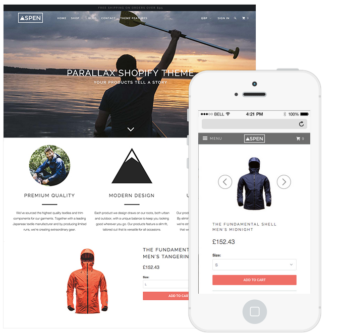
Parallax is a stunning theme featuring a long-format home page with unparalleled flexibility and control. It uses multiple backgrounds which seem to move at different speeds to create a sense of depth in your store.  You can create an impact with multiple parallax scrolling sections and the ability to purchase products on the home page.

Blockshop

Responsive and retina ready, the Blockshop theme draws on flat UI design - boasting spacious, customizable layouts with a minimal user interface that endures trends with simplicity and style. Blockshop is a unique, premium Shopify theme, perfect for emerging and established businesses, start-ups, boutiques and artisans.

Retina


Retina is a fantastic theme for any storeowner looking to add a polished feel to their store.  It supports high-res product images, responsive layout for widescreen and mobile devices, dedicated sidebar, product videos and much more.
Have you spotted a beautiful mobile optimized Shopify Theme in the wild?  Let us know in the comments below!
Looking for the perfect ecommere template for your business? Visit the Shopify Theme Store.
Need a little help getting your store looking just the way you want it? Get in touch with a Shopify Expert.

About The Author

Tucker Schreiber is an ecommerce entrepreneur and Content Marketer at Shopify. Get more from Tucker on Twitter.